Category: Make Art That Sells
Carolyn Gavin’s Home Decor Collection
Check out more terrific products Carolyn has with Anthropologie:


xo,
The Studio Ladies
See how Zoe uses an inky pen and quirky lettering in her art.
I’m delighted to show you our artist Zoe Ingram’s fresh new Home Decor line for Creative Co-Op! This very cool collection was created in my Make Art That Sells Home Decor Course. I love her fine inky line and charming lettering. It’s so rewarding to see our artists’ work come to life.
 Art Board designed by Zoe Ingram in my Creating Collections for Home Decor class.
 See more of Zoe’s work here.
xo,
The Studio Ladies
Get your mitts on new work by our artists! Check out these presentation boards.
Art directors: Get your mitts on this work for your amazing products! This is art that my artists did in my e-course Make Art That Sells: Creating Collections for Home Decor. I create 3 trend boards for each home decor course of what I think are the next trends. And the cool part is watching how these brilliant artists translate those trends into their own style, leading the way.
Katie Vernon’s Home Decor Collection with Anthropologie
Sometimes one of my artists will do work that they love, either in my courses or just for the pure joy of it. The cool part is seeing the variety of products the art ends up on when we pitch it to various companies. Teepees for Anthropolgie by Katie Vernon? Yeah.
Jessica Allen’s New Home Decor Collection. Farm House Vibes.
Check out these delightful plates that Jessica got as a result of her classwork.
 See more of Jessica’s collection here.
2016 Global Talent Search Finalists announced!

The wait is over. It’s time to reveal the 2016 Global Talent Search Finalists, chosen from the 50 Semi-Finalists (who were selected from nearly 1,000 artists’ work).
We are thrilled to unveil the SIX Finalists, knowing that one of these artists’ careers is about to change forever.
Five were chosen by our panel of industry experts, and one chosen via public vote (our peoples choice winner). The overall competition winner will be represented by Lilla Rogers Studio for two years, and win a host of licensing deals from prestigious companies (see here for the awesome prize details). The second assignment Lilla created was full of possibilities! The Semi-Finalists were asked to design a cover of a dessert recipe book from Sunny’s Cafe.
So without further ado, here we go…

Over 10,000 votes were cast by the public, and we can now reveal that the 2016 Global Talent Search People’s Choice Finalist is:
Mara Penny
Not only was Mara’s piece chosen through the public vote, she is also the top choice from our judges!
Comments from the judges:
“Mara Penny has full comprehension of the assignment. The feeling is delicate and feminine…like dessert! Nice contrast of color…inviting! Beautiful technique…love the lace doilies.”
“Mara Penny: Her composition, use of both arms and objects, and her palette all appealed to me. She created a bold book cover with quite a bit of detail as well. I’d pick this book up and hold it in my hands in a bookstore. Pretty work!”
“Mara Penny’s piece is eye grabbing! It is a complex illustration with lots of elements and the detail is wonderful — look at the tray of orange slices! Yet she lays the piece out in such a way that the piece feels clean and not too crowded.”
***

Our stellar panel of judges – with more than a century of industry experience between them in the Gift, Home Décor, Editorial and children’s book illustration, Fabric and Stationery, markets – took days deliberating over the Semi-Final gallery. It was incredibly hard to choose, but in the end the following five were selected as the other Finalists (in no particular order). Below each submission is a comment from the Judges on what stood out in the piece.
TERRI FRY KASUBA
Comment from the judges:
- Combines desserts with elements of nature and gardening.
- This is a magical place where the cake grows in plants and I love that sense of whimsy.
- Love the painterly style. Her work seems to have great editorial potential.
***
SHARON MONTGOMERY
Comments from the judges:
- Her hand-painted, textural work stands out from the crowd and screams, I AM PREMIUM.
- This is a beautiful cover and a gorgeous work of art as a standalone.
- Her daring black background. Her animals and flowers are nicely worked into the cake’s base and border.
***
MARENTHE OTTEN

Comments from the judges:
- This entire design is “pretty” and very sweet!
- Nice composition and central focal point
- Varied cake designs
***
COLEE WILKINSON

Comments from the judges:
- Highly detailed with so much happening in the piece yet it feels clean not too busy
- Has a bit of “Marie Antoinette” flavor….the marketplace can’t get enough of Paris!
- Nice technique and color – playful and sophisticated.
***
ANNE BENTLEY

Comments from the judges:
- Really stood out as being different from the rest.
- Her color choice was bold and her style of illustration is very interesting.
- Her style is editorial but could be adapted for products as well.
***
Lilla’s comments about the Finalists
***
The judges also answered two important questions for us:
In general what stood out to you about the artists you chose?
- All focused on the desserts, instead of the author of the cookbook. I found this appealing because it actually made me hungry and want something sweet!
- These artists also had designs that would stand out on a shelf.
- Many of them used dark backgrounds which really made their design elements stand out.
- I love bright colors and they definitely had the brightest, strongest colors of the bunch!
- All felt original and fresh–they stood out amongst the others as being inventive, thoughtful and well-rounded as illustrators.
- Each of them possess a high level of design skills that shone through in their pieces.
- Bold use of color and color contrast.
- Really liked the use of an unexpected dark background color. Sense of depth in the scene or interesting point of view.”
- Several of them have an artists approach rather than a graphic designers approach which I think is appealing in today’s market.
- They all look handmade or handpainted which is desirable. They also had a sense of humor in their work. People want to smile so this is important.
- Each of them has commercial potential in either the editorial or gift/stationery market, or both.
- Sophistication in their technique. A consistent style throughout the portfolio.
- Commercial appeal to the imagery.
What advice would you give to those who you did NOT choose, in order to make their work more commercially appealing?
“Develop a voice and look that’s your own. Stay on top of how your work stands up against others in the market. Do your research by absorbing a bit of reference each day and stretch your muscles by working on self-assigned projects that keep your work pertinent (take inspiration from all the MATS assignments!!). Most important: have fun with the art that you make so your personality shines through!! Approach every project, big or small, with a sense of adventure and conquer your creative challenges with spirit, flavor and style! “
“Book jackets need to be a clear read. There needs to be a strong focus, and clear legible lettering. Simplify it down and avoid being formulaic.”
“Human characters are really tough! Art directors and buyers tend to have a really particular point of view and it can make or break a commission or purchase. In my experience, the US commercial market is less open to funky/exaggerated illustrative perspectives on humans (compared to the European market or other international markets). Color contrast, dynamic composition, and a clear focal point are very important to make a product, book cover, etc. stand out from the crowd.”
“Make sure your style has a unique voice. It should be somewhat timeless. If you include people in your illustration make sure your audience can relate to them. Don’t make your drawing too childlike unless that is your audience. Know what demographic you are targeting. Have a sense of humor in your work. Everyone likes to smile. “
A closing note from Lilla:
Congratulations to everyone! We are thrilled that together 10,000 public votes, plus our judging panel comprising some of the top art directors and creative professionals in the industry, independently selected a set of Finalists where many are graduates of Make Art That Sells. It’s clear that the courses helped them develop commercially-viable art, choose amazing colors and present it professionally. We cannot wait to see the work that comes out of our brand new class “Illustrating Children’s Books” which begins on Monday October, 3, 2016.
Stay tuned for the third and final assignment and thanks to everyone for voting!
xo,
Lilla, Beth, and the Studio Ladies
***
Would you like to take Make Art That Sells?
We have the following courses currently open for registration HERE!
Do you dream of illustrating a children’s book? Would you love to create a magical world with characters that you’ve designed? Do you love the magic of children’s books and feel that you have something to offer? Then this course is for you.
In five weeks, you’ll create a brilliant children’s book pitch to help you land your dream children’s book gig. You’ll get over 20 videos, weekly assignments, live weekly video reviews, interviews with publishers and illustrators and more. Co-taught by top art agent Lilla Rogers and highly-respected children’s book art director Zoe Tucker.
Spaces are limited for our first session of class this October. Don’t miss out. REGISTER HERE
***
If you want to learn exactly what to put in your artwork to make killer portfolio pieces while staying true to your style and taste, MATS A and B is for you. Graduates of these courses have gone on to win work from clients such as Hallmark, Robert Kaufman Fabrics, Oopsy Daisy, Uppercase Magazine, West Elm, Midwest CBK, and more. It is industry learning that works in the real world. These comprehensive courses includes access to videos of Lilla Rogers reviewing over 500 pieces of art.
#MyGTSprep is back! Enter the Global Talent Search today
It’s Lilla here, artist agent, and I’m on the hunt for our next artist to represent.

I’m super excited to announce that it’s prep time for our annual Global Talent Search (GTS), one of the most closely-watched events in our industry. To help you get prepared, we will be sharing 5 free mini-assignments, known as the GTS Prep (#myGTSprep) all this week on the Make Art That Sells blog here. And if you have not yet registered for the Global Talent Search, book your place here and then dive into these ‘minis’ to help you get ready for the main competition.

Have you entered the 2016 Global Talent Search yet? Join us! This is an incredible opportunity not to be missed. Someone has to win, and it might just be you! Go on and take that leap. Registration closes next Wednesday, July 27th. Don’t miss out! Enter now!
Be sure to check the Make Art That Sells blog everyday this week for your free mini assignment and get those creative juices flowing.
Also, join us on Periscope today. It’s always fun.

xo,
Lilla
We Love Paint. We Love Line.
Looking to assign some stunning art? We’ve got some gorgeous eye candy for you. These artists know their way around paint and ink line.
Jessica Allen for Make Art That Sells: Creating Collections for Home Decor e-course
Rebecca Bradley for Canada Water Cafe
Trina Dalziel for Make Art That Sells: Creating Collections for Home Decor e-course
Please don’t hesitate to contact us to license, buy or commission art for your fabulous project.
We are happy to help you!
Sneak Peek of the Trend Boards

Here’s a sneak peek of the trend boards you’ll get when you sign up for CREATING COLLECTIONS FOR HOME DECOR. (There are over 50 images per board!)
Read all about how these cutting edge trend boards here.
WIN A FREE PLACE IN OUR UPCOMING GLOBAL TALENT SEARCH.
Share this Trend Board photo (above) on Instagram and Twitter with the #LillasTrends and tag @MakeArtThatSells on Instagram or @ArtThatSells on Twitter by May 2nd and we will pick one lucky winner! Learn more about this life changing contest here. Share away because it could be you!

ART by Zoe Ingram for Make Art That Sells Part C: Creating Collections For Home Decor
Class starts May 16th and runs daily for 5 weeks with weekly live reviews. This will be the last time we will be offering this course this year! Don’t miss out, sign up here.
xo,
Lilla
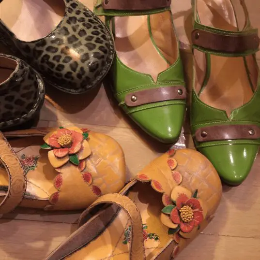
Mini assignment Number 3: Draw your shoes
Today you’re going to draw your shoes in any style you like. Draw your way.

*photo by Lilla Rogers
I picked this because it’s a common item and fun to draw.
Suggestions:
Think about the view. You can draw a top view or a side view, for example.
Draw only in pen at a café on the back of your receipt.
Take only 15 minutes.
Why did I pick shoes for your assignment? So often we draw for a purpose: a job, a paid assignment, as a gift for someone, for our Etsy shop. That can put undue pressure on the experience of art-making. In my course I stress that you draw for the fun of it for the first few days of every week. I give you a specific topic to draw.
You love art, remember? For this, just draw. Get to know the subject matter. Have a play date with the subject matter. In class, I call these little drawings the Mini assignments.
For the purpose of Mini’s it’s also key to keep the thing you’re going to draw very finite and small so as to not overwhelm you like, for example, drawing the entire New York skyline.
Can’t wait to see your shoes!
Xo
Lilla
Ps. It’s also key to have the subject matter something that matters to you, like your own shoes. That gives you a greater sense of involvement. However, art rules were meant to be broken, so you can draw shoes that you wish you owned, too.
#mymatsprep #shoes


